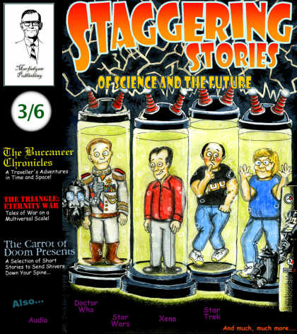
"...Hold The Front Page!..." or "How Staggering Stories Artwork is Created"
by Andy Simpkins
For a very long time now, I have been a science-fiction fan. It always amazes me how authors of this genre can take a blank piece of paper and project their creative processes onto it by means of the written word. We are taken to far flung places and times, do battle with alien fleets bent on enslaving Humanity, make peaceful contact with intelligent extra-terrestrial species and find out what our role in the galaxy and how the Human species will evolve. Another important facet of this is the role played by the science-fiction illustrator. It is their job to taken a given piece of story or manuscript and translate it, via the medium of pen, ink, paint or any other artistic medium at their disposal, plus a hefty dose of imagination, and depict a scene or story that is both credible and can hold the looker transfixed.
I have enjoyed the works of many science-fiction illustrators. The first artist who grabbed my attention was probably Chris Foss back in the early 70's. This British illustrator, with his depictions of lumbering, miles-long behemoth-like spaceships and futuristic cities, ensnared my attention and paved the way for me to buy books by many other illustrators. Jim Burns and Peter Jones are stable mates of Chris Foss but their artwork offers a tantalising glimpse of what the future holds by way of the marriage of technology and the natural world. Their artwork depicts not spaceships that have been manufactured but grown.
Another artist of the same ilk is Roger Dean. He was another major influence on me. His work back in the 1970's was primarily designing album covers for many bands, first and foremost, the progressive rock band Yes. His work is a perfect example of how science and nature can exist in perfect harmony. By way of note, Roger Dean is a very good friend of Steve Howe;the lead guitarist with Yes and I had the pleasure of meeting Roger at a Yes concert down in Brighton several years ago.
"Where do you get your ideas from? "I hear you clamour. By way of explanation, I will say that, by it's very nature, Staggering Stories is a science-fiction fan website. I will be the first to say that we are not above poking a little fun at ourselves and the genre in particular and the whole site is to be taken with a pillar of salt, to say the least... Nothing wrong with that but the only loser was Lot's wife. Look in the Bible and you will see what fate she suffered...
A couple of years ago, shortly after Staggering Stories had just celebrated its first birthday, I said to Adam, Keith and Tony:"Why don't I design a 'front cover' for the site? ". In all honesty, I had not done any artwork since I was at school studying for my A-Levels and I was decidedly rusty. The others readily agreed and I was left with the Herculean task that most illustrators have;namely that of looking at a blank piece of paper until my artistic Muse leapt out from behind the sofa and gave me a hefty whack around the head with an artistically-inspiring length of lead piping...
To most science fiction readers, what does the title:"Staggering Stories" conjour up? Images of those 1930's and 40's pulp science-fiction magazines that were so prevalent in the US back then where mad scientists created robots that eventually went on the rampage in laboratories that had lightning tubes fizzing and crackling away;space-suited lantern-jawed heroes striding purposefully over Martian landscapes in order to zap Martian uglies with their ray guns or to seduce an alien princess; or majestic streamlined rocket ships hovering in orbit over an Earth which had no cloud cover and had the North American continent predominantly on display on its surface (Hmmmmmm... I am a great admirer of the American conceptual artist, Chesley Bonestall, but there can be a little of the waving of The Stars and Bars in his work...). You will see that my artwork is an affectionate tip of the hat towards covers like those.
You will see that I have drawn a couple of covers in the past for the website. The first one pays homage to its American predecessors in its garish primary colouring and the content;namely that of us four being held in the grasp of a giant mechanical Sot'm. Some of you will say that it is an imitation of the cover of Queen's 'News Of The World' album and I can only say I agree with you!Let no-one say the dreaded word 'plagiarism' but I must confess that I was prone to that when I did the second cover for Staggering Stories. The initial idea was ripped off... no!... taken from the February 1939 cover of Astounding Stories (later called Astounding Science-Fiction) as painted by the notable American artist of that time;Hubert Rogers, who was to become the main front cover illustrator for what many considered to be the magazines Golden Age;a crashed spaceship on an alien planet but where there were 2 astronauts crawling from the wreckage looking for shelter and food, I took the idea and twisted it around 180 degrees so there would be spacesuited renditions of Keith and Tony having a blazing row;yours truly sitting on a rock in the foreground contemplating our fate with a forlorn look on my face and Adam, after scouting around, sees the fast-approaching and menacing Sot'm's and is shouting to us that we have more pressing concerns on our hands. All this was topped of with a rather large learner driver L-plate affixed above the main air lock, suggesting that we had taken the ship out for a driving lesson and made a complete c*ck-up of it!
Armed and my artistic loins firmly girded for the task, I set about creating pieces of work that were hopefully eyecatching and captured the light-hearted spirit and quintessentially downright English tongue-in-cheek daftness that is Staggering Stories... The reason for this is the fact that I have grown up with quite a few British and American popular cartoon strips influencing me, including Gary Larson's :'The Far Side' with its bizarre melange of humans, cows and other creatures meeting in farcical situations;The timeless, classic 'Peanuts' cartoon strip created by Charles M. Schulz and from this side of the Atlantic, the extremely strange works of Glen Baxter who's works are always depicted in a very 'Boys Own' style and the 'Wicked Willie' illustrations of Gray Jolliffe and Tray Parker. As a result, I have tried to inject a little dose of their collective styles of humour into all the work I do for this site.
Inspiration can be a very elusive thing and one does spend a lot of time thinking about what to put down on paper. However, I am fortunate (or not ) in having an imagination that can best be described to a swamp:still, festering and covered with a surface layer of algae but occasionally a bubble of creativity escapes from the primordial soup below and erupts at the surface emitting a gargantuan burp of release after percolating for ages amid all the rotting vegetation of my sub-conscious. So without further ado, let me take you by the hand and show you through a step by step guide of how the latest front cover was produced and give you an insight into the creative processes that lurk in the dank and dusty corners of my mind....
Apart from studying for my O and A-Level Art, I never really pursued art as a career. While I was at school, the only mediums I used were powder-based paints, pencils, charcoals, pastels and inks. I never really delved into the mediums of oil paints, watercolour, guache or any of the other mediums that most artists like to use today and so I felt most comfortable in utilising the mediums I mentioned earlier and was familiar with. Besides, all the work I have done on this site is done on A4 paper and so I wanted to use a medium in which detail and shading can be rendered on a small scale, hence using pencils, ink and the occasional use of acrylic paints.
In the time honoured tradition of most artists, I normally start of with a blank piece of A4 paper and stare at it until inspiration strikes but in this instance, I had a fairly clear idea of what I wanted to put down on paper mapped out in my mind. However, what is laid out in 3-D Technicolour in your minds eye and how you translate it into a 2-D image on paper is slightly more difficult. If any nit-pickers out there want to say that I drew my inspiration from another source, the new front cover does bear some slight similarity to the cover for British '70's Punk Rock band;X-Ray Spex's first album:'Germ-Free Adolescents' where the lead vocalist Polly Styrene and the other members of the band are sealed away in giant hermetically sealed test-tubes. This is the only similarity I can think of. All other ideas are mine and mine alone...
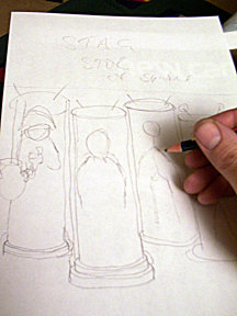
As you can see in Figure 1, a lot of pencil marks, lines and thumbnail sketching is required in order to place all the respective elements of the picture in their place and may be subject to alteration and even being removed altogether. The basic idea of the four editorial staff of Staggering Stories being 'grown' in giant incubation tanks with their progress being closely monitored by a team of Sot'm scientists was an idea that took seed in my mind quite a while ago and I have spent some considerable time at work thinking about how the cover should be laid out and what to include in it.
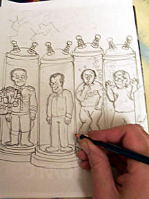
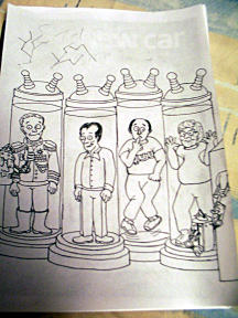
With the basic cover layout scrawled down on the paper, it was just a matter of refining and elaborating upon it until I had a rough pencil illustration laid down on paper that was ready to have the ink outlines drawn on as depicted in Figure 2. Figure 3 shows the completed sketch with all the relevant outlines inked in. To give you some insight why we have been depicted like we are, I will explain. Adam, being the only one of us who has extensive knowledge of computers and software, is affectionately known as 'El Presidente' because he has in his possession the scientific acumen to take over the civilised world and enslave Humanity in order to further his nefarious plans for world domination. However, all evil power-mad geniuses have to have humble beginnings and I have depicted him as a dictator of a small Third World Central American country, complete with the gaudy uniform festooned with gold braid and medals that he has awarded himself in order to impress his adoring and heavily co-erced subjects. I was originally going to depict him as Napoleon Bonaparte but getting a rather large tri-cornered hat upon his head in an incubation tank was pushing it just a little too far!
Keith, being the creative genius behind the stories on the site, is shown as being fairly normal apart from the unblinking staring eyes which are enough to faze any normal person. People who are close to the Dunn family will recognise this expression from one of their cats;Ozzy who I think is a feline version of Donald Pleasence with his gimlet-like eyes and the ability to go for hours without blinking. This was originally shown in the 'contact us' section and the fine illustrations of Kit Sivyer which he sent to us when the site was first set up.
Yours truly is another fairly ordinary rendition with the exception that I have firmly nailed my colours to the mast, so to speak, and am openly wearing a T-Shirt with a logo of the worlds best 12-bar rock and boogie band. Just as a whimsical touch, if you look closely in the direction that my caricatures eyes are following, you will see a suspicious stream of bubbles being forcibly emitted from an area not too far from the back of my jeans but more on that later. I have also included an appropriately embarrassed expression on my face as well. As for Tony, another ordinary depiction but as Fate always likes to poke him with a stick to see what reaction can be elicited, I have just portrayed him as staring into the middle distance contemplating how Fate can be so cruel and pondering upon the which-ness of what...
These three sections depicted so far represented the most difficult part in preparing the illustration as a lot of correction, rubbing out and general cursing on my part was required in order to set the groundwork for the next step:that of of colouring in the illustration. Lets just say that a lot of A4 paper met a crumpled demise in my wastepaper basket before I was satisfied with the finished result...
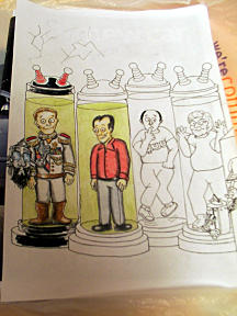
Figure 4 shows the colouring in taking place. Adam was fairly easy to do as the dress uniform he is wearing is white and just needed a few embellishments in the form of tasselled epaulettes, medals and battle-stripes that any self-respecting dictator would award himself and knee-length riding boots
in order to complete the ensemble. A lot of shading was used in order to portray darkened areas, such as under the chin, where the arms are in relation to the torso and on the legs and also to highlight the various features and make them stand out more. One of my art teachers used to call this process 'luminosity' and can be applied in order to bring out various characteristics. Facial features and skin tones were done in a lightly applied light brown pencil and some areas, such as cheekbones, forehead and chin were left relatively untouched in order to give the impression that they were a lighter and more prominent feature. As you can see, the steps leading down from the tubes and the tops of the tubes are only partially filled in as they are reflecting the glow from both the tanks and the lightning being emitted from the 'superconductors' on top and will have partial shading filled in later.
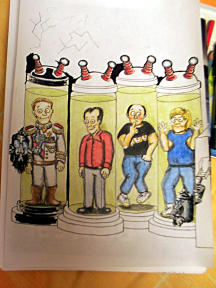
Figure 5 shows all the 'incubation' tubes filled in with their primary colours and all the characters coloured and shaded to add an element of 3-D. Both Sot'm scientists have also be coloured and shaded. Their facial features are lighter as they are both facing a brighter light source in the picture and they are coloured correspondingly. The Sot'm on the left was comparatively easy to draw as 'he' is giving the thumbs-up to a colleague to trip the master switch in order to bring their 'creations' to life. I have never really been good at drawing hands as the multitude of positions that they can assume has been rather daunting for me. If I have to draw them, I normally have to take a digital picture of a hand in the position I want to place it in the picture and then copy it from the printout. However, I was quite pleased by the way I drew Tony's hands and the lighter shades of skin-tone that were used to show what areas of his palms and fingers were pressed up against the glass. The easiest part was drawing around the upper part of the 'superconductors' and the bases of the 'incubation' tubes with a fine nib felt-tip pen in order to delineate the areas that were to be filled in with a broad nib black marker pen.
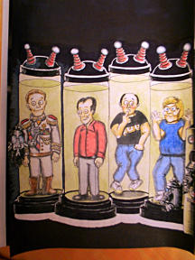
Figure 6 and almost all the donkey work is done. All the relevant areas that need to be filled in with black ink have been completed. The archaic 1950's style control cabinet on the right hand side of the picture has been filled in with a selection of old-style analogue meters and gauges, complete with that staple feature of old science fiction and horror movies:the clunky handle that is dramatically pulled down in order to send a surge of electricity through anything that comes its way. As you can see, the floorspace around the 'incubation' tubes has been left untouched. More partial shading, both black and graduated green was applied in order to portray the greenish glow from the 'incubation' tubes petering out the further away from them the illumination got.
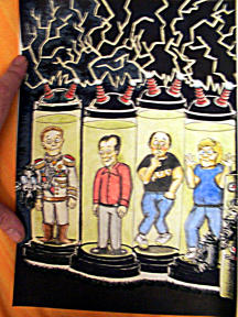
Figure 7 and I am in the home straight, Hurrah!. Using a fine point modelling paintbrush, I had a merry old time painting the lightning flickering through the air above the 'incubation' tubes and passing between the 'superconductors' on each of the tubes. I only had modelling paints at my disposal but using very light brush strokes, I was able to draw relatively fine lines. The only downside I found out later on was the fact that when modelling enamel paints dry on paper, the paint tends to flake and slough off. As a result, between sessions, I had to keep the picture flat as possible in order to avoid the picture curling at the edges, due to all the paint and pigment drying on the paper and causing it to contract, and to stop any of the recently applied paint from flaking off.
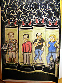
Figure 8 and all that needs doing is to apply an 'ethereal glow' around the various flashes of lightning in the upper portion of the picture. Through a happy accident, I found the best way to do this was to draw around the 'lightning' with a medium grey pencil which showed up quite well against a black background. By way of a finishing flourish, I invested the hefty sum of £1.25 for a white-ink pen from a local stationers which I then used to show any reflective surfaces on the tubes and to draw those all-important bubbles (especially the ones coming from my nether-regions!) filtering through the fluid in the tanks and to add the all-important signature and to date the work.
Well, that's pretty much it for the actual front cover but one feature I tended to before starting out on the new illustration was the matter of the banner header. I was toying with the idea of seeing if I could come up with a new font-style title for the front page, but after putting the matter to a vote, it was decided to keep the existing Showcase Gothic font, albeit with new colour shading and outlines by way of carrying on with the feel of continuity to the front covers. I originally found this font displayed on the front covers of the American sci-fi pulp magazine;Startling Stories. 'Staggering Stories' is not a far cry from that and the font used is bold, innovative and eye-catching. Given the colour outline of the banner title is light blue, I thought it appropriate that it should be placed over the area where the lightning is crackling and fizzing away as it would be more eye-catching and dramatic.
All that remained to be done was to give Adam the completed artwork and a floppy disc with the new banner title for him to format and to place on the site with the latest update. Over a period of approximately three weeks, I spent about fifteen hours all together designing and drawing the new front cover.
Well, I trust that has given you some insight into the creative processes and work that went into the creation of the latest 'front cover' for this website of ours. I might not be the next Chris Foss, Rodney Matthews or Roger Dean but I hope I will be the first Andy Simpkins...
